Choosing paint colors can feel like staring at an endless wall of chips at the hardware store, but there’s a shortcut to creating rooms that look professionally designed: analogous color schemes. Instead of guessing which shades complement each other, this approach uses colors that sit side by side on the color wheel, think blues flowing into greens, or yellows melting into oranges. The result? Spaces that feel cohesive, calm, and intentional without requiring a design degree. Whether you’re repainting a bedroom or rethinking your entire open-concept main floor, understanding how analogous palettes work gives you a reliable framework for color decisions that won’t leave you second-guessing your choices six months later.
Table of Contents
ToggleKey Takeaways
- An analogous color scheme uses three to five adjacent colors on the color wheel and creates cohesive, calm spaces by following a 60-30-10 distribution across dominant, supporting, and accent hues.
- Test paint samples on 2′ × 2′ sections of each wall under your actual lighting conditions and at different times of day, since undertones and light exposure dramatically affect how analogous colors read in your space.
- Balance saturation levels within your analogous color scheme by using a muted dominant color, mid-tone supporting shade, and brighter accent to prevent visual overwhelm or flatness.
- North-facing rooms require warmer analogous palettes to avoid ice-cold effects, while south-facing spaces can handle cooler tones; always consider existing fixed elements like flooring and countertops when selecting your color family.
- Introduce neutrals and vary texture and finish in an analogous color scheme to add depth and prevent color fatigue, which is especially important in open-concept layouts and smaller bedrooms.
- Avoid matching saturation across all three colors and ignore undertone differences, as even adjacent hues on the color wheel can clash if they lean toward different undertones (cool blue versus warm blue-green).
What Is an Analogous Color Scheme?
An analogous color scheme uses three to five colors that sit next to each other on the standard 12-hue color wheel. Common combinations include blue, blue-green, and green: or red, red-orange, and orange. Because these hues share underlying pigments, they create natural harmony without the jarring contrast you’d get from complementary (opposite) colors.
On a practical level, one color acts as the dominant shade, covering roughly 60% of the visual space in a room, while the second serves as a supporting hue (30%), and the third functions as an accent (10%). That ratio isn’t a hard rule, but it prevents any single color from overwhelming the space or creating visual confusion.
Most paint manufacturers organize their fan decks by color family, which makes selecting analogous shades straightforward. Pick a primary color you like, then move one or two chips left or right within the same strip. You’ll often find the manufacturer has already balanced undertones, making it easier than mixing across brands. Just remember: undertones matter. A warm yellow-green next to a cool blue-green can still feel off, even though they’re adjacent on the wheel.
Why Analogous Color Schemes Work in Interior Design
Analogous palettes reduce decision fatigue. When you’re coordinating furniture, textiles, trim, and accessories, working within a narrow color family means fewer clashing combinations. A sage green sofa works with teal pillows and seafoam curtains without requiring a mood board or endless returns to the home store.
From a psychological standpoint, analogous schemes feel restful because they mimic color transitions found in nature, sunsets, forests, shorelines. Color combinations that reflect natural patterns tend to register as soothing rather than stimulating. That’s why you’ll often see blue-green-teal ranges in bedrooms and bathrooms, where relaxation is the goal.
They’re also forgiving during touch-ups and future updates. If you need to repaint one wall or replace a piece of furniture, staying within the same analogous family means your new addition will likely blend in rather than stick out. That built-in flexibility is especially useful in homes where projects happen in stages over months or years.
How to Choose the Right Analogous Colors for Your Space
Start by assessing natural light. North-facing rooms tend to pull cooler tones even cooler, so a blue-green-violet scheme might feel icy. South-facing rooms with warm, direct sun can handle cooler analogous palettes without feeling sterile. East and west exposures shift throughout the day, morning cool, afternoon warm, so test paint samples on all walls and observe them at different times.
Paint one 2′ × 2′ section on each wall you plan to paint, not just one test spot. Colors read differently depending on adjacent surfaces, shadows from trim, and ceiling height. Let the samples dry fully: wet paint looks different than cured.
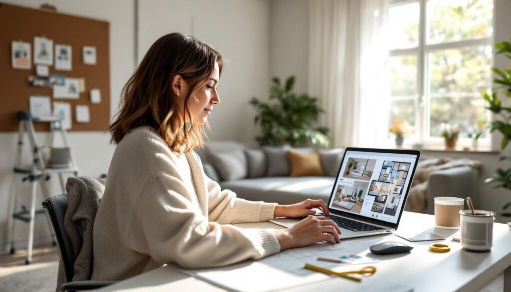
Consider existing fixed elements you can’t easily change: flooring, countertops, tile. If you have honey oak floors, a warm yellow-orange-red analogous scheme will harmonize better than cool blues. Granite counters with gray-blue veining? Lean into blue-green-teal. Many homeowners try to fight their fixed finishes and end up frustrated. Interior design rendering software can help visualize options before committing to gallons of paint.
Balance saturation and value (lightness/darkness). Three highly saturated colors in similar values can vibrate visually and feel overwhelming. Instead, vary the intensity: a muted dominant color, a mid-tone supporting color, and a brighter accent. For example, pale seafoam walls, medium teal furniture, and vivid turquoise pillows.
Applying Analogous Color Schemes Room by Room
Living Rooms and Open Spaces
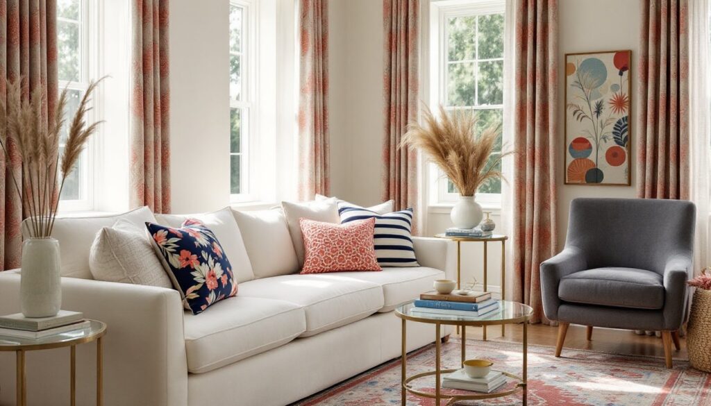
Open-concept layouts benefit from analogous schemes because they create visual flow without requiring identical paint throughout. Use the dominant color on the majority of walls, the secondary color to define a feature wall or architectural element like a fireplace surround, and the accent color in textiles and decor.
For example, a warm palette might include Benjamin Moore’s Navajo White (dominant), Goldfinch (supporting accent wall), and Orange Parrot (throw pillows and artwork). The progression feels intentional but not matchy.
In larger spaces, introduce a neutral to break up the color. Warm grays or greiges work with warm analogous schemes: cool grays pair with blues and greens. This prevents color fatigue and gives the eye a resting point. Using principles from rhythm in interior design, repeating your accent color in multiple spots, pillows, art, a vase, creates visual cohesion.
Textural variety matters more in analogous schemes than in high-contrast palettes. Since you’re not relying on color contrast for interest, mix matte and glossy finishes, smooth and nubby fabrics, painted and natural wood. A monochromatic room can feel flat: a well-textured analogous room feels layered.
Bedrooms for Relaxation
Bedrooms are ideal testing grounds for analogous color schemes because the goal is usually calm, not stimulation. Cool analogous palettes, lavender, soft blue, pale aqua, lower visual energy and support sleep.
Paint the ceiling in the lightest version of your dominant color rather than stark white. This envelops the room in color without feeling heavy. For instance, if walls are a muted blue-gray, a ceiling in the palest blue-white softens the whole space.
Bedding and window treatments carry a lot of visual weight in bedrooms. Choose your secondary and accent colors here. If walls are soft sage, try seafoam green duvet and teal throw pillows. Linen and cotton in similar hues feel organic and relaxed: high-sheen fabrics can look too formal unless that’s the intent.
Be cautious with warm analogous schemes (reds, oranges, yellows) in bedrooms. While they can feel cozy, highly saturated warm colors can be stimulating. Tone them down with muted or dusty versions, think terracotta, peach, soft gold, and balance with plenty of white or cream in trim and linens. Concepts from organic interior design pair well with earthy analogous tones in bedrooms.
Common Mistakes to Avoid with Analogous Color Palettes
Ignoring undertones. Even within a color family, undertones can clash. A blue with purple undertones won’t harmonize with a blue that leans green. Hold paint chips together in natural light and look for subtle differences. If they feel off together as chips, they’ll feel worse on whole walls.
Skipping the neutral. All color, no break, can overwhelm a space, especially in smaller rooms. White trim, natural wood, or neutral furniture provides visual breathing room. Many design tips emphasize balance, and neutrals are key to achieving it in colorful rooms.
Matching saturation across all three colors. If your dominant, secondary, and accent colors all have the same intensity, the room can feel flat or visually noisy. Vary the saturation: a soft dominant, medium secondary, punchy accent (or vice versa, depending on the mood you want).
Forgetting about flooring and ceilings. Flooring often represents a significant color mass in a room. If you have dark walnut floors and choose a blue-green-teal scheme, the warmth of the wood can make the blues look gray or muddy. Test colors with actual flooring samples, not just in isolation. Similarly, if the ceiling is low, painting it the same shade as the walls in an analogous scheme can make the room feel smaller. Lighten it by two or three shades.
Not accounting for lighting temperature. Bulb color temperature (measured in Kelvin) affects how paint reads. Cool white or daylight bulbs (5000K+) will make warm analogous schemes look less vibrant: warm bulbs (2700K-3000K) can muddy cool schemes. Choose bulbs that support your palette. Test paint samples under your actual installed lighting, not just daylight.
Overlooking texture and finish. Flat paint absorbs light: satin or semi-gloss reflects it. In an analogous scheme, varying sheen can add subtle dimension. For instance, matte walls in your dominant color, satin trim in your secondary color, and a glossy accent in decor. Many homeowners find inspiration by studying how texture and sheen interact in professional designs.