Walking into a room that feels right is no accident. It’s the result of deliberate choices, color, layout, lighting, and texture working together. Good design isn’t about following trends blindly or blowing the budget on statement pieces. It’s about understanding how spaces function and making smart decisions that fit both the room and the people using it. Whether someone’s tackling a whole-house refresh or just tired of staring at the same beige walls, these practical strategies cut through the fluff and get to what actually works.
Table of Contents
ToggleKey Takeaways
- Interior design tips and tricks start with a clear vision and practical plan, including room measurements and a realistic budget with 15-20% cushion for unexpected costs.
- The 60-30-10 color rule—60% dominant, 30% secondary, and 10% accent color—creates visual balance and prevents the need for repainting from color mistakes.
- Floating furniture away from walls and maintaining proper walkway clearance (30-36 inches for main paths) improves traffic flow and makes rooms feel intentional and functional.
- Layered lighting combining ambient, task, and accent lighting creates depth and flexibility, while keeping light temperatures consistent within a space (warm 2700-3000K for living areas, cool 3500-4100K for kitchens).
- Paint updates, hardware swaps, and strategic secondhand shopping deliver professional design results on a budget, with the highest ROI coming from fresh paint and mixing textures like knit throws over velvet chairs.
- Adding texture and patterns at varied scales—combined with appropriately-sized rugs and vertical elements—creates visual interest that makes spaces feel layered and intentional rather than sterile or staged.
Start with a Clear Vision and Plan
Jumping into a design project without a plan is like framing a wall without measuring, things get crooked fast. Before buying a single throw pillow or paint sample, take stock of what the space needs to do. Is it a living room that hosts movie nights and toddler chaos? A bedroom that needs to feel calm after long workdays? Function dictates form.
Start by measuring the room, actual dimensions, not guesses. Note window placements, door swings, outlets, and any architectural quirks like sloped ceilings or radiators. Sketch a rough floor plan on graph paper or use a free digital tool. This prevents the classic mistake of falling in love with a sofa that won’t fit through the doorway.
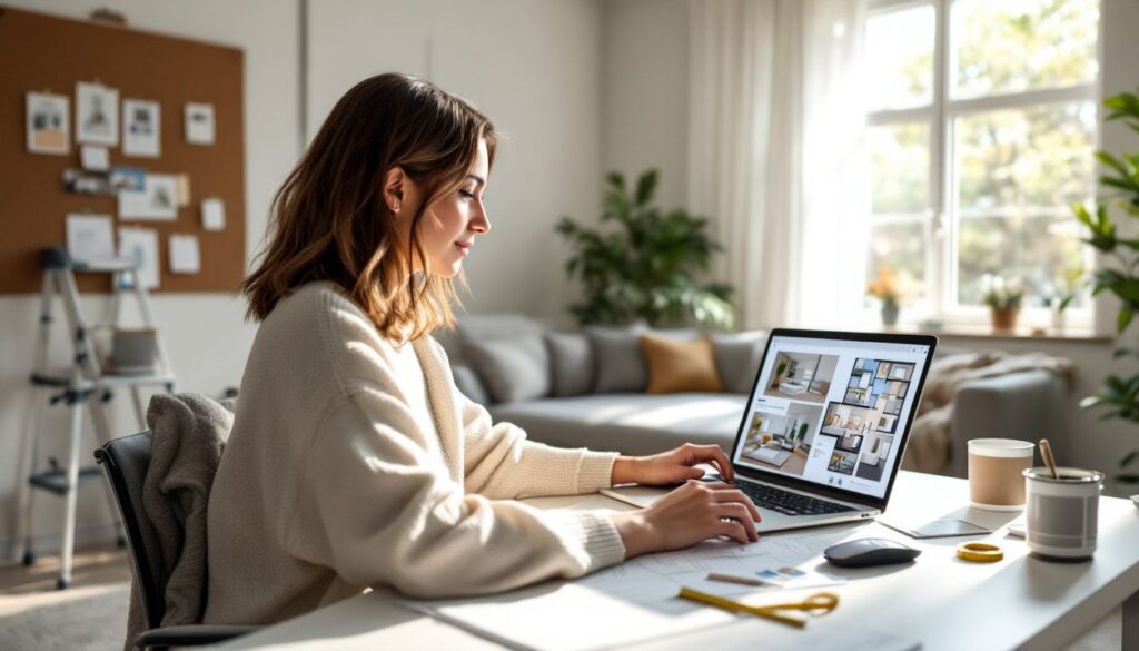
Next, gather inspiration, but be selective. Pin images that share common threads, maybe it’s all warm neutrals with natural wood, or bold patterns with vintage furniture. Look for the underlying principles, not just pretty pictures. Many homeowners find creating a design proposal helps clarify their vision and keeps the project on track.
Set a realistic budget and build in a 15-20% cushion for unexpected costs. Design projects always reveal surprises, a wall that needs patching, trim that should be replaced, or that perfect light fixture that’s slightly over budget but worth it.
Master the Art of Color Selection
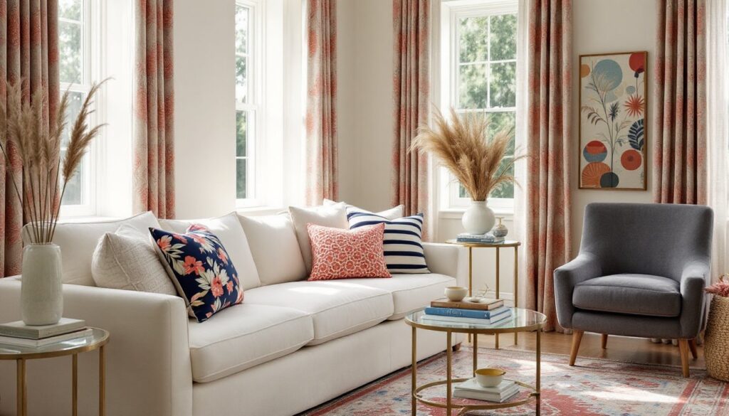
Color makes or breaks a room, and it’s where most DIYers either nail it or end up repainting. The 60-30-10 rule is a solid starting point: 60% dominant color (usually walls), 30% secondary color (upholstery, curtains), and 10% accent color (pillows, artwork, accessories). This creates balance without visual chaos.
Test paint samples on the actual walls, at least 2×2 feet sections, and observe them at different times of day. Morning light, afternoon sun, and evening lamplight all change how color reads. North-facing rooms skew cooler and benefit from warm tones: south-facing rooms can handle cooler palettes. What looks like a soft gray in the store might turn lavender or green depending on the room’s light.
For a cohesive flow between rooms, use varying shades of the same color family or stick to a consistent undertone (warm or cool). Abrupt color shifts from room to room make spaces feel choppy and smaller. Neutral walls aren’t boring, they’re a backdrop that lets furniture, art, and textiles do the talking. According to professional design advice, creating a color story throughout the home builds visual rhythm.
Don’t forget ceilings and trim. Bright white trim against colored walls creates crisp definition. A ceiling painted one shade lighter than the walls can make a room feel taller. Painting the ceiling the same color as the walls (popular in small spaces or rooms with interesting architecture) creates a cocooning effect.
Maximize Space with Smart Furniture Placement
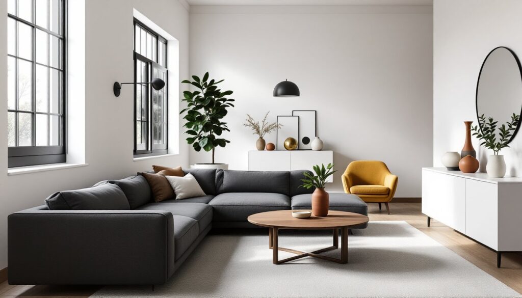
Furniture placement is structural, it defines traffic flow, conversation zones, and how functional the room actually is. Start with the room’s focal point: fireplace, window with a view, or media center. Arrange seating to face or frame this feature, not fight it.
In living rooms, float furniture away from walls. Pushing everything against the perimeter makes the room feel like a waiting area. Pull the sofa 12-18 inches off the wall, anchor it with a rug, and create an intimate conversation zone. Side tables should be within arm’s reach of seating, about 24-26 inches tall to match standard sofa arm height.
Leave adequate walkways: 30-36 inches minimum for main traffic paths, 18 inches between a coffee table and sofa. Furniture that blocks natural flow or forces people to sidestep creates daily frustration. In bedrooms, ensure at least 24 inches of clearance on both sides of the bed for making it and moving around comfortably.
Scale matters. A massive sectional in a 10×12 room overwhelms the space: delicate chairs in a large open-plan area look lost. Measure furniture before buying, and use painter’s tape on the floor to mock up dimensions. Multi-functional pieces, storage ottomans, extendable dining tables, Murphy beds, earn their keep in smaller homes.
Consider sight lines from room to room. What’s visible from the entryway or kitchen? Strategic furniture placement can hide clutter zones or frame appealing vignettes. Understanding rhythm in design helps create visual flow throughout connected spaces.
Layer Lighting for Depth and Ambiance
Single overhead lights flatten a room and cast harsh shadows. Layered lighting, combining ambient, task, and accent lighting, creates depth and flexibility. Think of it like mixing paint: each layer adds dimension.
Ambient lighting is the base layer: recessed cans, flush-mount ceiling fixtures, or chandeliers that provide overall illumination. Aim for about 20 lumens per square foot in living areas, 50 in kitchens, and 10-20 in bedrooms depending on preference. Put overhead lights on dimmers to adjust intensity for different activities and times of day.
Task lighting targets specific work areas: pendant lights over kitchen islands, under-cabinet LED strips (eliminating shadows on counters), reading lamps beside chairs, or vanity lights flanking bathroom mirrors. For reading, aim for 40-50 watts equivalent (LED) at about shoulder height to prevent glare.
Accent lighting highlights architectural features, artwork, or plants: picture lights, track lighting, wall sconces, or even LED strips behind floating shelves. This creates visual interest and draws the eye around the room.
Mix light temperatures thoughtfully. Warm white (2700-3000K) feels cozy in living spaces and bedrooms: cool white (3500-4100K) works better in kitchens, bathrooms, and workspaces where clarity matters. Mixing temperatures in the same room creates an unsettling effect, keep them consistent within a space.
Don’t underestimate natural light. Keep window treatments functional but not blocky. Sheer curtains diffuse harsh sun while maintaining privacy: blackout shades work for bedrooms. Clean windows make a noticeable difference, something easy to overlook but worth the effort.
Add Personality with Texture and Patterns
A room full of smooth surfaces, painted drywall, leather sofa, glass table, feels sterile no matter how good the color palette is. Texture creates visual interest and makes spaces feel layered and intentional, not staged.
Mix materials deliberately: a chunky knit throw over a smooth velvet chair, a jute rug under a sleek wood coffee table, linen curtains against painted shiplap. Each surface catches light differently and adds tactile variety. In kitchens, contrast matte cabinet finishes with glossy tile backsplashes: in bathrooms, pair smooth porcelain with natural stone or textured wallpaper.
Patterns follow a similar mixing principle, but require more restraint. Combine patterns at different scales: large-scale florals with small geometric prints, wide stripes with tiny dots. Keep them in the same color family to maintain cohesion. A common guideline is one large pattern, one medium, one small, plus a solid to give the eye a rest.
Rugs anchor pattern and texture in a room. A patterned rug can tie together disparate furniture pieces: a textured solid (like a wool flatweave or shag) adds depth without competing with patterned upholstery. Make sure rugs are appropriately sized, under a dining table, add 24 inches beyond the table edge on all sides so chairs don’t fall off when pulled out.
Don’t forget vertical texture: grasscloth wallpaper, board-and-batten wainscoting, exposed brick (if it’s original and in good shape, not fake peel-and-stick), or even a gallery wall with varied frame styles and depths. These elements create architectural interest in otherwise flat spaces, much like organic design principles emphasize natural materials and varied textures.
Budget-Friendly Design Hacks That Make a Big Impact
Good design doesn’t require a contractor’s salary. Strategic choices deliver professional results without the professional price tag.
Paint is the highest ROI upgrade. A fresh coat transforms tired spaces for the cost of materials and a weekend. Don’t just paint walls, update dated cabinets with a quality bonding primer and cabinet-grade paint (about $40/quart, covering roughly 100 square feet). Painting interior doors and trim in a crisp white or deep contrasting color costs little but reads as high-end.
Hardware updates are criminally underrated. Swapping builder-grade cabinet pulls, door knobs, and light switch covers takes minutes per piece and costs $3-10 per item. The cumulative effect is dramatic. Match finishes throughout the space, mixing brushed nickel, oil-rubbed bronze, and chrome looks unintentional.
Rearrange what’s already there. Move furniture between rooms, edit down accessories, or swap art and mirrors to different walls. Design inspiration from experts often emphasizes working with existing pieces in fresh ways. Sometimes a room just needs fewer things, not different things.
Shop secondhand strategically. Vintage wood furniture, solid-brass lamps, and quality rugs can be found for a fraction of retail at estate sales and online marketplaces. Refinish or reupholster if needed, a can of stain and some sandpaper can revive tired wood pieces. Skip upholstered items with questionable origins (hello, bedbugs).
Focus budget on what touches the body. Cheap sheets feel cheap every single night: a quality mattress affects sleep and health. Invest in a good sofa if it gets daily use, but save on occasional chairs. Mix high and low, splurge on a handmade rug, pair it with affordable side tables.
DIY simple upgrades, hire out the complex. Installing peel-and-stick backsplash, hanging curtain rods, or building basic shelving are accessible projects. Electrical work, structural changes, or anything involving permits should go to licensed professionals. For more budget-conscious approaches, additional design resources that break down affordable room transformations.
Use removable solutions in rentals. Peel-and-stick wallpaper, removable hooks, freestanding shelves, and curtains mounted on tension rods allow personalization without forfeiting the security deposit. Command strips rated for the appropriate weight can hang art and mirrors without nails.
Conclusion
Design isn’t about perfection or following a prescribed style playbook. It’s about creating spaces that work for the people living in them, rooms that look good but also function well day after day. Start with a solid plan, make intentional choices about color and layout, and layer in personality through texture and lighting. The best spaces evolve over time, with pieces added as budget and need dictate, not all at once from a catalog.