Michael S. Smith isn’t just another interior designer, he’s the guy who decorated the Obama White House, and his work defines what sophisticated American style looks like today. His rooms don’t scream “designer was here.” Instead, they feel like they’ve always existed, perfectly balanced between grandeur and the kind of comfort that makes you want to kick off your shoes. If you’ve ever walked into a space that felt both polished and inviting, chances are it borrowed from Smith’s playbook. This guide breaks down his design DNA and shows how to translate those principles into real, buildable projects for your own home.
Table of Contents
ToggleKey Takeaways
- Michael Smith’s interior design philosophy emphasizes timeless, collected-over-time aesthetics with classical proportions and quality materials that stand the test of time rather than chasing trends.
- Signature Michael Smith design elements include architectural millwork, layered neutral textures, symmetrical balance, and strategic use of antique or vintage anchors to add history and soul to spaces.
- You can blend traditional and contemporary aesthetics by respecting architectural bones, editing out fussiness, and carefully curating no more than two or three design periods per room.
- Smart budget decisions involve splurging on high-quality upholstery, flooring, and window treatments while saving on occasional tables, artwork, and decor through vintage finds and thoughtful curation.
- Smith’s color palette centers on warm neutrals, soft grays, creams, and muted earth tones paired with natural materials like honed marble, walnut, linen, and wool that age gracefully with minimal gloss.
- Practical DIY improvements like upgrading baseboards and crown molding (3½ to 5 inches depending on ceiling height), layering lighting with warm bulbs, and using tinted primer before quality eggshell paint deliver designer-level impact affordably.
Who Is Michael Smith and Why His Design Philosophy Matters
Michael S. Smith built his reputation on a deceptively simple idea: rooms should look collected over time, not decorated all at once. Based in Los Angeles, he’s worked on everything from California estates to 1600 Pennsylvania Avenue, earning the Bunny Williams Award and a spot in the Architectural Digest AD100 list multiple times.
What sets Smith apart is his refusal to chase trends. While other designers pivot to whatever’s hot on Architectural Digest this season, Smith anchors his work in classical proportions, quality materials, and a respect for architectural context. He’s not afraid of pattern, color, or ornament, but he uses them with restraint.
His philosophy matters for DIYers because it’s anti-disposable. Smith designs for longevity, which means investing in fewer, better pieces and understanding how scale, proportion, and light actually work in a room. That’s a mindset you can apply whether you’re reupholstering a single chair or planning a whole-house renovation.
For anyone tackling interior design tips on a budget, Smith’s work proves you don’t need to gut a room to elevate it, you just need to edit ruthlessly and respect the bones of the space.
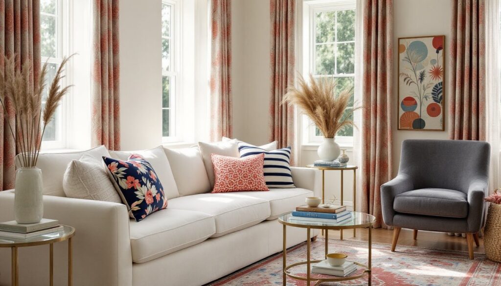
Signature Elements of Michael Smith’s Design Style
Smith’s interiors share a handful of recognizable traits: layered neutrals, classical furniture with clean lines, and an emphasis on natural light. He’ll pair a Louis XVI bergère with a streamlined linen sofa, or set an 18th-century console beneath contemporary art. The mix works because he’s disciplined about scale and silhouette.
Key signature moves include:
- Architectural millwork: Crown molding, paneling, and built-ins aren’t afterthoughts. Smith treats them as the framework that holds a room together. If you’re adding trim, use 3½-inch or wider baseboards and crown molding at least 4 inches tall in rooms with 8-foot ceilings. Larger rooms with 9- or 10-foot ceilings can handle 5- to 7-inch profiles.
- Symmetry and balance: Pairs of lamps, matching nightstands, centered artwork. This isn’t stiff formality, it’s visual calm.
- Texture over pattern: Smith layers materials, linen, wool, silk, leather, natural stone, so rooms feel rich without busy wallpaper or loud prints.
- Antique and vintage anchors: A single well-chosen antique (a marble-top table, a gilt mirror, a Persian runner) gives a room history and soul.
When sourcing materials, think about how light interacts with surfaces. Smith favors matte and low-luster finishes, flat or eggshell paint, honed marble, oiled wood, because they age gracefully and don’t compete for attention.
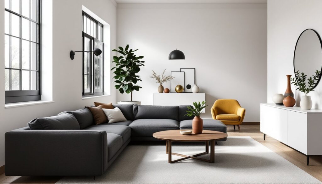
Blending Traditional and Contemporary Aesthetics
The Smith signature is all about tension: old meets new, formal meets casual. A room might feature a Regency-style armchair next to a minimalist side table, or a traditional Persian rug anchoring a space filled with contemporary photography.
To pull this off in your own space, start with architecture. If you’ve got good bones, original hardwood, picture rails, divided-light windows, don’t fight them with ultra-modern finishes. Instead, restore and highlight them, then bring in streamlined furnishings that let the architecture breathe.
If your home lacks architectural detail, add it strategically. Install picture frame molding (1×3 or 1×4 pine, mitered at corners, painted to match walls) to create panels. Use a miter saw for clean 45-degree cuts, and a brad nailer with 18-gauge, 1¼-inch brads to secure trim. Fill nail holes with lightweight spackle, sand smooth, then prime and paint.
Conversely, if your space already leans traditional, edit out the fussiness. Swap heavy drapes for linen or cotton panels hung on simple rods. Replace ornate light fixtures with cleaner designs that still respect the room’s proportions. Platforms like Homify showcase global examples of this balance in action.
The key is curation. Don’t try to represent every era in one room, pick two or three periods max, and let them converse.
How to Incorporate Michael Smith’s Design Principles in Your Home
Smith’s principles translate into actionable DIY projects. Start with spatial editing: remove anything that doesn’t earn its place. Smith’s rooms never feel cluttered because every object has a reason to exist.
Practical steps:
- Audit your layout. Use painter’s tape on the floor to map out furniture footprints before moving anything. Aim for 30 to 36 inches of clearance around major pieces for comfortable traffic flow.
- Invest in one statement piece per room. It could be an antique dresser, a quality area rug, or a piece of original art. Let that anchor the space, then build around it with simpler, more affordable pieces.
- Upgrade trim and hardware. Swapping builder-grade door casing for 3½-inch Colonial or Craftsman-style trim (actual dimension: 3½” × ¾”) costs around $1.50 to $3 per linear foot and makes a significant visual impact. Replacing hollow-core doors with solid-core or five-panel doors adds heft and sound dampening.
- Use primer and quality paint. Smith’s walls often appear in soft, complex neutrals. Achieve this with a tinted primer (especially over dark or bold existing colors) followed by two coats of low-VOC, eggshell or matte finish paint. Coverage is typically 350–400 square feet per gallon, so measure wall area (length × height, minus openings) before buying.
- Layer lighting. Overhead fixtures alone create harsh shadows. Add table lamps, floor lamps, and picture lights on dimmers. Use warm white bulbs (2700K–3000K) to mimic incandescent glow.
Safety note: If you’re installing new ceiling fixtures or adding outlets, hire a licensed electrician or work under permit if required by local code. Electrical work must comply with the National Electrical Code (NEC), jurisdictions vary, but tampering with wiring without proper knowledge is a fire hazard.
Creating Livable Luxury on Any Budget
Smith’s interiors feel expensive because of proportion, finish quality, and editing, not because every item costs a fortune. You can replicate the effect by choosing where to splurge and where to save.
Splurge on:
- Upholstery fabric and frame quality for pieces you’ll use daily (sofa, dining chairs). Look for kiln-dried hardwood frames and 8-way hand-tied springs if budget allows.
- Flooring. Solid hardwood or high-quality engineered wood (¾-inch thick wear layer) will outlast laminate and can be refinished. Budget $6–$12 per square foot installed for oak or maple: exotic species run higher.
- Window treatments. Custom or well-fitted ready-made panels in natural fibers make a room feel finished. Measure from rod to floor, add 4 inches for a slight “puddle” or stop ½ inch above the floor for a tailored look.
Save on:
- Occasional tables and accessories. Vintage shops, estate sales, and online marketplaces often have solid wood pieces that just need refinishing.
- Artwork. Frame affordable prints, photographs, or even pages from old books in quality frames. A well-framed $30 print beats a cheap canvas any day.
- Decor and textiles. Rotate pillows, throws, and small objects seasonally. Smith’s rooms evolve: yours should too.
Drafting a solid interior design proposal before starting helps clarify priorities and prevents expensive mid-project pivots.
Color Palettes and Material Choices Inspired by Michael Smith
Smith’s color palette rarely ventures into bold primaries. Instead, he works within a spectrum of warm neutrals, soft grays, creamy whites, and muted earth tones, colors that shift with natural light throughout the day.
Typical palette framework:
- Walls: Warm whites (with undertones of cream, beige, or gray), soft taupes, greige (gray-beige blends), or pale celadon and sage.
- Trim and millwork: Bright white or off-white in satin or semi-gloss for contrast and durability.
- Accents: Navy, charcoal, deep olive, rust, or muted terracotta. These show up in textiles, not walls.
- Metals: Unlacquered brass, bronze, nickel, and pewter. Avoid shiny chrome or gold unless you’re going for a specific period look.
When selecting paint, test samples on at least two walls (one with natural light, one without) and observe them at different times of day. Paint looks different on a horizontal chip versus a vertical wall, and lighting temperature affects perceived warmth.
Material choices:
- Wood: Walnut, oak, and mahogany in natural or lightly stained finishes. Avoid orange-toned polyurethane: opt for water-based poly or hardwax oil for a more natural look.
- Stone: Honed marble (Carrara, Calacatta), limestone, soapstone. These are porous, seal them properly with a penetrating sealer rated for the stone type.
- Textiles: Linen, cotton, wool, and silk. Avoid synthetic sheens. For upholstery, performance fabrics with stain resistance (like those treated with Crypton or similar) offer durability without sacrificing natural appearance.
- Flooring: Wide-plank hardwood (5 to 7 inches wide), natural fiber rugs (jute, sisal, wool), or classic patterns like herringbone and chevron.
Resources like Elle Decor frequently showcase designer palettes and material pairings, offering visual reference points for color interaction.
Iconic Michael Smith Projects You Can Learn From
Several of Smith’s high-profile projects offer lessons for home-scale work. The Obama White House refresh (completed in 2010) showed how to honor history while making spaces feel contemporary and comfortable. Smith reupholstered existing pieces, introduced soft grays and blues, and layered American-made textiles, all moves that kept the project rooted in context.
His Rancho Mirage estate featured in design publications demonstrates how indoor-outdoor flow works in practice: consistent flooring materials (limestone inside and on terraces), large glass doors, and plantings that frame views without blocking light.
Takeaways for DIYers:
- Respect existing architecture. Don’t try to make a mid-century ranch look Victorian. Work with the style you have.
- Create visual continuity. Use the same flooring in adjacent rooms, or keep wall colors within the same tonal family throughout the main living areas.
- Invest in transitions. Thresholds, door casings, and baseboards that tie rooms together matter more than you’d think. Use matching profiles and finishes to avoid visual choppiness.
- Frame views. If you’ve got a nice yard or window with decent light, treat it like artwork. Keep window treatments simple and make sure furniture placement encourages people to look outside.
Safety and permitting note: If a project involves structural changes (removing walls, adding windows, altering rooflines), consult a structural engineer and pull permits as required by the International Residential Code (IRC) or local amendments. Load-bearing walls can’t be removed without proper support (beams, posts, footings), and improper work can compromise safety and resale value.
For those exploring professional design paths, understanding these project-level decisions is critical, interior design jobs increasingly require both creative vision and construction literacy.
Smith’s projects prove that timeless design isn’t about avoiding risk, it’s about making informed, intentional choices and executing them with care.