Mixing patterns in a room feels intimidating, until someone breaks down the logic. Most homeowners stick with solids or a single safe stripe because they think pattern layering is reserved for designers with expensive educations. Not true. Pattern mixing follows a few practical rules, much like running wiring follows the NEC or framing follows load requirements. Once someone understands the framework, scale, color, and distribution, combining florals, geometrics, and textures becomes less guesswork and more method. This guide walks through the principles, proven combinations, beginner tactics, and common pitfalls so anyone can confidently layer patterns without turning their living room into visual chaos.
Table of Contents
ToggleKey Takeaways
- Mixing patterns in interior design follows a structured framework based on scale, color, and distribution, transforming an intimidating task into a methodical process anyone can master.
- Varying pattern scales—pairing large-scale, medium-scale, and small-scale patterns together—is the golden rule of mixing patterns and prevents visual competition.
- A cohesive color palette acts as the unifying thread; ensure patterns share a common base color and limit the overall palette to three to five colors for harmony.
- Proven pattern combinations like stripes with florals, geometrics with organics, and plaids with textured solids offer reliable starting points for confident mixing patterns.
- Start with low-commitment pieces like pillows before layering patterns into rugs, upholstery, and window treatments, then use the 60-30-10 rule to balance pattern dominance.
- Always anchor patterned spaces with solid-colored elements and sufficient neutral areas to prevent visual overload and allow the eye to rest.
Why Mixing Patterns Works in Interior Design
The human eye craves visual interest, but it also seeks balance. A room filled entirely with solids reads flat and sterile, like drywall primed but never painted. Patterns introduce energy, movement, and personality. When layered correctly, they create depth without clutter.
Pattern mixing taps into the same design principle as rhythm and flow, repetition with variation. A single bold pattern might dominate a space, but combining multiple patterns distributes visual weight across the room. This prevents any one element from screaming for attention while keeping the space dynamic.
Historically, pattern mixing has been a hallmark of confident design. The 1980s embraced bold, maximalist layering with geometric prints, florals, and stripes colliding unapologetically. Today’s approach is more refined but borrows that same fearlessness. Designers now use pattern as a tool to unify disparate furniture styles, bridge color transitions, and add character to builder-grade spaces without structural changes.
From a practical standpoint, pattern hides wear better than solids. A geometric rug camouflages foot traffic. A striped pillow won’t show every coffee drip. For DIY decorators working with existing furniture or rental limitations, patterns offer high impact with zero demo work.
The Golden Rules for Combining Patterns Successfully
Pattern mixing isn’t random. It follows a structure, like studs at 16 inches on center or paint applied in two coats. Break these rules once someone masters them, but learn them first.
Vary Your Pattern Scales
The most critical rule: never use patterns of the same scale side by side. Scale refers to the size of the repeating motif. A large-scale floral with 8-inch blooms next to a large-scale paisley creates visual competition, both patterns fight for dominance, and neither wins.
Instead, pair a large-scale pattern (oversized florals, big geometrics) with a medium-scale pattern (mid-sized stripes, moderate damask), and anchor both with a small-scale pattern (tiny dots, fine herringbone, or tight checks). This trio prevents patterns from blurring together or clashing.
For example, a sofa upholstered in a large botanical print pairs well with medium-width striped curtains and small-scale geometric throw pillows. The eye reads them as complementary layers rather than competing voices. According to guidance from House Beautiful, this scale variation is the foundation of nearly every successful pattern scheme.
In practice, aim for at least two steps of scale difference between adjacent patterns. A 6-inch medallion print and a ½-inch gingham read as distinct. A 6-inch medallion and a 5-inch ikat muddle together.
Stick to a Cohesive Color Palette
Patterns can be wildly different, florals, stripes, plaids, abstracts, as long as they share a common color thread. Think of color as the grout between mosaic tiles: it unifies the composition.
Start with a base color that appears in every pattern, even if only as an accent. Add one or two secondary colors that pop up across most patterns. Limit the full palette to three to five colors total. More than that, and the room loses coherence.
For instance, a navy-and-white stripe, a navy-coral-cream floral, and a small-scale coral geometric all share navy and coral. The cream acts as a neutral bridge. Even though the patterns are distinct, the color overlap creates harmony.
Neutrals, white, cream, gray, black, tan, act as pattern multipliers. A black-and-white toile doesn’t count as a “color” in the same way a jewel-tone paisley does. Neutrals ground busy patterns and give the eye a rest, much like how texture balances visual weight in a space.
Popular Pattern Combinations That Always Work
Some pattern pairings have proven themselves over decades of real-world use. These aren’t trends, they’re reliable formulas.
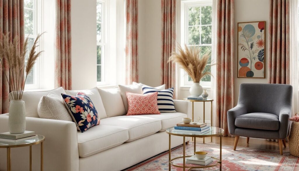
Stripes + Florals: This is the workhorse combination. Stripes provide structure and direction, while florals add organic softness. A classic example: ticking stripe pillows on a chintz sofa. The stripe’s geometry balances the floral’s curves. Vary the scale, large blooms with narrow stripes, or bold wide stripes with ditsy florals.
Geometrics + Organics: Pair angular patterns (chevrons, Greek keys, hexagons) with flowing, irregular patterns (paisleys, ikats, animal prints). The contrast creates tension in a good way. A Moroccan tile-print rug under a sofa with an organic leaf-print cushion hits this balance.
Plaids + Solid Textures: Plaids (checks, tartans, gingham) mix well with heavily textured solids like cable-knit throws, linen curtains, or nubby wool. The plaid reads as a pattern, while the texture adds dimension without additional print. This combination works especially well in casual, layered spaces like dens or bedrooms.
Stripes + Stripes: Yes, mixing different stripe widths and orientations works. Pair horizontal and vertical stripes, or a wide awning stripe with a pinstripe. The key is significant scale difference and slight color variation. A navy-and-white wide stripe with a navy-and-cream thin stripe avoids monotony.
Global Mix: Combine patterns from different design traditions, a Suzani pillow, an Indian block-print throw, a Scandinavian geometric rug, unified by a shared color story. This approach, championed by MyDomaine, leans eclectic but feels intentional when color ties it together.
How to Start Mixing Patterns as a Beginner
Diving straight into a five-pattern room is like framing a second story before the foundation cures. Start small, build confidence, then layer.
Step 1: Start with pillows. They’re low-commitment, easy to swap, and forgiving. Choose a dominant pattern for the largest pillow (an 18-inch or 20-inch square), a complementary medium-scale pattern for the next size down, and a small-scale accent for lumbar pillows or smaller squares. Keep the color palette tight, three colors max.
Step 2: Add a rug. A patterned rug anchors the room and introduces a new scale. If the pillows are small- to medium-scale, go large-scale on the rug, or vice versa. The rug should share at least one color with the pillows.
Step 3: Introduce window treatments or upholstery. Once comfortable with pillows and a rug, add pattern via curtains, roman shades, or a chair slipcover. This is where scale hierarchy matters most, avoid matching the rug’s scale exactly.
Step 4: Layer in art or wallpaper. If the room handles it, wallpaper on one accent wall or a gallery wall of prints can add a fourth or fifth pattern layer. Treat these as large-scale elements and balance them with smaller-scale soft goods.
Pro tip: Use the 60-30-10 rule adapted for pattern. Allocate 60% to your dominant pattern (usually the largest piece, like a sofa or rug), 30% to a secondary pattern (curtains, bedding), and 10% to accent patterns (pillows, throws). This prevents pattern overload while maintaining interest.
Safety note: When working with fabric, especially vintage or secondhand textiles, check for mold, dust mites, or weak fibers before cutting or sewing. Wash or dry-clean first to avoid staining adjacent surfaces.
Common Pattern Mixing Mistakes to Avoid
Even experienced DIYers trip over these pitfalls. Recognizing them early saves time and fabric.
Using only one scale. This is the number-one error. Three medium-scale florals together look like wallpaper samples, not a cohesive design. Always vary scale, large, medium, small.
Ignoring color temperature. Mixing warm-toned patterns (rust, gold, terracotta) with cool-toned patterns (navy, gray, ice blue) without a neutral bridge creates dissonance. Stick to one temperature family, or use white, cream, or black to mediate.
Overloading with busy patterns. Not every pattern needs high contrast or intricate detail. If using a bold, high-contrast pattern (like a black-and-white buffalo check), balance it with lower-contrast patterns, soft watercolor florals, tone-on-tone damasks. Think of contrast like paint sheen: flat, satin, and gloss all have a place, but all-gloss reads garish.
Forgetting about texture. Patterns and textures both add visual interest. An all-smooth-fabric room with multiple patterns can still feel flat. Incorporate textural elements, a jute rug, linen curtains, velvet pillows, to support the patterns and add depth.
Matching too perfectly. Overly coordinated “sets”, matching curtains, pillows, and bedding from the same fabric line, read stiff and impersonal, like a hotel room. Real homes accumulate pieces over time. Intentional mismatch, unified by color, feels curated and lived-in. Insights from Homedit emphasize that slight imperfection often elevates pattern schemes.
Skipping the neutral anchor. A room with five patterns and zero solids overwhelms the eye. Anchor the space with solid-colored upholstery, walls, or flooring to let patterns breathe. Neutral doesn’t mean beige, charcoal, navy, forest green, or even black work as grounding tones.
Pattern on pattern on pattern without rest. Give the eye a break. A solid throw, a plain side chair, or a clear glass coffee table interrupts pattern flow and prevents sensory overload. This is especially important in small rooms where visual clutter compounds quickly.