Choosing a color palette can feel like staring at paint chips until your eyes blur. But there’s a shortcut that designers have used for decades, one that delivers bold, balanced rooms without the guesswork. The triadic color scheme pulls three evenly spaced colors from the color wheel, creating vibrant combinations that feel intentional, not chaotic. It’s a step up from safe neutrals, but it won’t give you the visual whiplash of throwing random hues together. Whether you’re repainting a living room or planning a full renovation, understanding how triadic palettes work gives you a reliable framework for confident color decisions.
Table of Contents
ToggleKey Takeaways
- A triadic color scheme uses three evenly spaced colors from the color wheel, creating balanced, vibrant interiors without clashing or visual chaos.
- Apply the 60-30-10 proportion rule: use your dominant color for 60% of the room, secondary color for 30%, and accent color for just 10% to prevent overstimulation.
- Adapt saturation levels based on room function—high saturation for creative spaces, medium for living areas, and low saturation (pastels and tones) for bedrooms and relaxing spaces.
- Test your triadic color combination in multiple lighting conditions and times of day before committing, as paint appears differently under morning, midday, and evening light.
- Stick with neutral fillers like white, gray, black, and wood tones to support your triadic palette rather than introducing a fourth color, which will break the design system.
What Is a Triadic Color Scheme?
A triadic color scheme uses three colors that sit equally spaced around the color wheel, imagine forming a perfect triangle. Classic examples include the primary triads (red, yellow, blue) and secondary triads (orange, green, purple).
The geometry matters. Because the colors are evenly distributed, they create visual tension without clashing. You’re not pairing neighbors (like analogous schemes) or opposites (like complementary schemes). Instead, you’re pulling from different sections of the spectrum, which gives rooms energy and dimension.
Most triadic palettes lean vibrant, think jewel tones or saturated primaries. But you can dial down the intensity by choosing tints (lighter versions) or tones (muted with gray). A soft coral, mint green, and lavender still form a triad, just with lower saturation. The color wheel fundamentals apply whether you’re working with bold or pastel versions.
In practical terms, this means you’re selecting one dominant color, one secondary, and one accent. The rule of three keeps things from feeling too matchy-matchy or too scattered.
Why Use a Triadic Color Scheme in Interior Design?
Triadic schemes solve a common DIY problem: how to add color without making a room feel like a kindergarten. They offer contrast without the stark drama of complementary pairs, and variety without the visual soup of too many unrelated hues.
Here’s what you gain:
- Balance across the color spectrum: Because your three colors span different sections of the wheel, the palette feels complete. You’re not stuck in the cool-tone or warm-tone ghetto.
- Flexibility in saturation: You can go bold with all three, or tone down two and let one pop. That control is harder with analogous schemes, which often feel too subtle.
- Clear hierarchy: One color dominates, one supports, one accents. This built-in structure prevents decision fatigue when you’re picking pillows, rugs, and wall colors.
Triadic palettes also photograph well, important if you’re documenting a renovation or planning to sell. The variety reads as intentional design, not random thrift-store finds. Rooms using organic interior design principles often pair triadic schemes with natural textures to keep the palette from feeling too synthetic.
The downside? Triadic schemes demand commitment. If you pick three colors and then add a fourth on a whim, the whole system collapses. You need discipline to stick with your triad, using neutrals (white, black, gray, beige) as fillers rather than introducing new hues.
How to Choose the Right Triadic Color Combination for Your Space
Start with the room’s function and natural light. A north-facing bedroom with little sun can handle warm triads (red-orange, yellow-green, blue-violet) to compensate for cool light. South-facing rooms with lots of sun can take cooler triads without feeling sterile.
Consider existing fixed elements, flooring, countertops, built-ins. If you’ve got honey oak cabinets or terracotta tile, those warm tones will bias your palette. Choose a triad that either complements or deliberately contrasts those anchors. Fighting your existing materials is a losing battle.
Test saturation levels before committing:
- High saturation (pure hues): Best for accent walls, kid’s rooms, creative studios, or spaces you want to feel energetic. Think fire-engine red, cobalt blue, sunflower yellow.
- Medium saturation (slightly muted): Works in living rooms, kitchens, and dining areas where you want interest but not overstimulation. Picture terracotta, sage green, dusty plum.
- Low saturation (pastels or tones): Ideal for bedrooms, bathrooms, and spaces meant for relaxation. Consider blush pink, seafoam, soft lavender.
Paint sample boards (not just swatches on the wall) with your three colors. View them in morning, midday, and evening light. Paint lies under different lighting conditions, what looks balanced at noon might skew garish at 7 PM under incandescent bulbs.
Sites like MyDomaine showcase real-world triadic palettes across different design styles, which helps you visualize how theory translates to actual rooms. Just remember that professional photos are lit and edited: your results will vary.
Balancing Your Triadic Colors: The 60-30-10 Rule
The 60-30-10 rule prevents triadic schemes from looking like a circus tent. It’s a proportion guideline, not a law, but it works.
- 60% dominant color: Walls, large furniture pieces, flooring (if you’re choosing). This anchors the room and gives your eye somewhere to rest.
- 30% secondary color: Upholstery, area rugs, curtains, secondary wall (like an accent wall or adjacent room visible through a doorway).
- 10% accent color: Throw pillows, artwork, decorative objects, lampshades, small furniture like side tables.
In practice, this often means your dominant color is the most neutral or muted of your triad. If you’re working with teal, coral, and mustard, teal might cover 60% in a soft, grayed-down version. Coral takes 30% at medium saturation in fabrics and a feature wall. Mustard hits 10% in pillows, a throw blanket, and picture frames.
You can flip the proportions for drama, say, 60% bold coral, 30% muted teal, 10% mustard, but that’s an advanced move. Most DIYers find it easier to live with when the dominant color is the calmest.
Don’t forget neutrals. White trim, black window frames, gray sofas, and wood tones don’t count toward your triad percentages. They’re the supporting cast that lets your three colors shine. Incorporating principles of rhythm interior design helps you repeat your triad colors in a pattern that feels intentional, not random.
If you’re planning a whole-house palette, you can shift which color dominates room by room while keeping the same triad. Teal-dominant living room, coral-dominant bedroom, mustard-dominant home office, all tied together by the shared palette.
Room-by-Room Triadic Color Scheme Ideas
Living Room Triadic Palettes
Living rooms handle triadic schemes well because they’ve got enough surfaces to distribute all three colors without crowding.
Purple, orange, green triad (jewel-tone version):
- 60%: Deep eggplant purple on three walls, light neutral on the fourth.
- 30%: Burnt orange sofa or pair of armchairs, plus a patterned area rug that pulls in both purple and orange.
- 10%: Emerald green in velvet throw pillows, a potted fiddle-leaf fig, and a ceramic vase.
This combination works in mid-century modern or eclectic styles. The orange warms up the purple, and the green keeps it from feeling too Halloween.
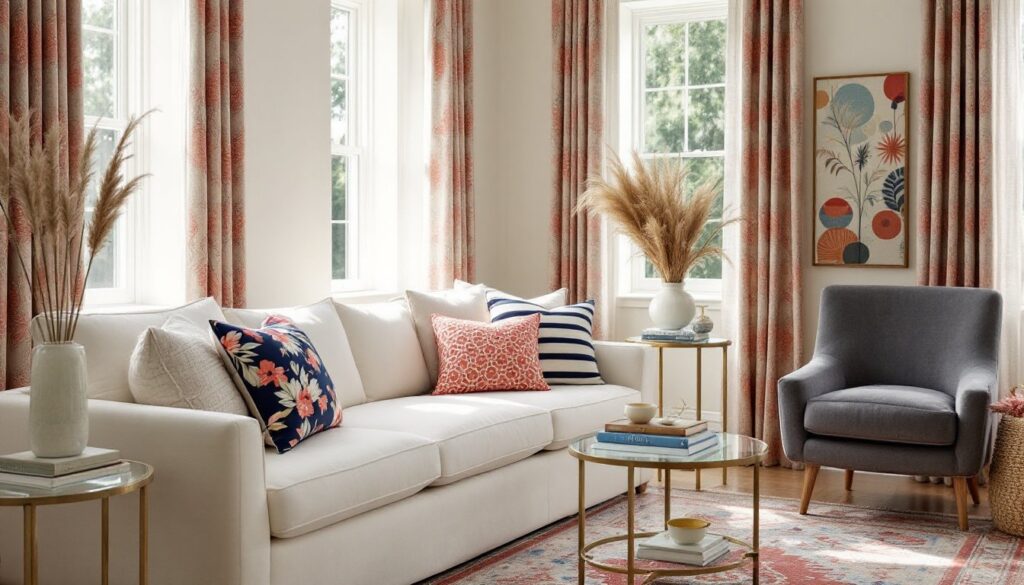
Red, yellow, blue triad (primary, softened):
- 60%: Soft buttery yellow walls (not school-bus yellow, think cream with a yellow undertone).
- 30%: Dusty blue sectional and curtains.
- 10%: Brick-red accent pillows, a red-spined book collection, and a vintage red lamp.
This reads traditional or farmhouse, especially if you add natural wood and linen textures. The 1980s interior design era loved bold primaries, but toning them down makes the triad livable in 2026.
Avoid pattern overload. If your rug has all three colors, keep pillows and curtains mostly solid. One patterned element per triad is usually enough.
Bedroom Triadic Color Schemes
Bedrooms need restraint. High-saturation triads can overstimulate, so lean into tints and tones.
Coral, mint, lavender triad (pastel version):
- 60%: Soft lavender walls or a lavender duvet cover as the dominant textile.
- 30%: Mint green upholstered headboard or dresser (painted furniture works great here).
- 10%: Coral in throw pillows, a knit blanket folded at the foot of the bed, and a small piece of coral artwork.
This palette suits coastal, shabby-chic, or modern farmhouse styles. It feels airy without being cold, which is the sweet spot for bedrooms.
Teal, rust, goldenrod triad (earth-tone version):
- 60%: Warm white or greige walls, with a teal upholstered bed frame or teal bedding.
- 30%: Rust-colored area rug and linen curtains.
- 10%: Goldenrod velvet bench at the foot of the bed, plus small goldenrod accents in lamp bases or picture frames.
This works in boho, southwestern, or contemporary spaces. The rust grounds the cooler teal, and the goldenrod adds a punch without screaming for attention. Applying interior design tips around texture variation keeps these palettes from feeling flat, mix matte paint, glossy ceramics, and nubby textiles.
Pro tip: If you’re painting bedroom walls, test your triad in the actual room for at least 48 hours. Bedrooms get different light than living areas, and a color that looks perfect in the showroom might feel off at bedtime. Using interior design rendering tools can help visualize the palette digitally before buying paint.
Keep metallics neutral, brushed brass, matte black, or natural wood. Adding gold and silver on top of your triad introduces too many visual threads. Stick with one metal finish throughout the room.
Finally, if you’re drafting an interior design proposal for a client or even for your own planning, sketch out where each color falls using the 60-30-10 breakdown. It’s easier to adjust on paper than after you’ve already painted. For more room-specific inspiration and styling strategies, Home Bunch offers real-home examples that show how designers apply color theory in functional spaces.